


GQ Sports Rebranded: Giving the Kansas City Chiefs’ Logo a New Spin
Close BannerClose00Days:00Hours:00Minutes:00SecondsWatch LiveGQ Bowl in NOLAGQ SportsThe KC iconography is timeless and, in this decade, has become a symbol of dominance. But we wanted to explore some ways to give it a fresh look.By Matthew RobersonFebruary 7, 2025Save this storySaveSave this storySaveThe Kansas City Chiefs have become one of the most unstoppable forces in professional sports. Every January and February, the team becomes a juggernaut, romping their way through the NFL playoffs. One more win and they become the first team ever to run off three straight Super Bowl titles, strengthening the case for Patrick Mahomes’ GOAT status, further cementing the Hall of Fame credentials of stalwarts like Travis Kelce and Chris Jones, and making their interlocking KC logo even more synonymous with modern football supremacy.But what if the team were to re-think this logo? Designer Justin Thomas Kay tackled this question in the latest episode of “GQ Rebranded”, diving deep into the aesthetic history of a franchise that was founded in 1960 as the Dallas Texans before moving to Kansas City in 1963 and adopting the Chiefs name and logo that has become so ubiquitous today.For Kay, that ubiquity is a huge part of the equation. He views the legacy franchises of American sports as the guideposts for an exercise like this, citing the Bulls, the Celtics, the Yankees, and Green Bay (“As a shareholder,” Kay notes, “I’m obligated to put the Packers in here.”) Any team exploring a rebrand, Kay suggests, should aspire to what those teams have achieved—a design philosophy that isn’t about chasing trends. “You want to really think on a decades-long timescale,” Kay says. “I would like to see more new team branding across all sports take that approach. Simplicity is one thing, but you want to be expressive and truly culturally resonant through that clarity and simplicity.”Understanding that the Chiefs have a rich history—they played in the very first Super Bowl, after all—and have kept their look mostly untouched since the ‘60s, Kay didn’t want to completely overhaul things with his new design.“It was an interesting challenge to look at a team that for all intents and purposes has no need for a new logo, but instead is an example of an identity that just needs some more connective tissue to pull together all the different pieces,” Kay said.The result of Kay’s work is a new, lightly tweaked logo that gives the K and C some more room to breathe. He also put a slight remix on the arrowhead that forms the outline of the KC crest, and gave the team a new wordmark that incorporates a black outline. When it came time to rethink the uniforms, he suggested a stripe down the middle of the helmet, something that makes any football ensemble really sing.“The main thing for me is to find something that really resonates with the fanbase and community culture. It needs to truly and honestly mean something to the fans.” Chiefs fans, while watching the team try to pull off a historic threepeat, spare a thought for how the team could also improve its wardrobe.

The Kansas City Chiefs have become one of the most unstoppable forces in professional sports. Every January and February, the team becomes a juggernaut, romping their way through the NFL playoffs. One more win and they become the first team ever to run off three straight Super Bowl titles, strengthening the case for Patrick Mahomes’ GOAT status, further cementing the Hall of Fame credentials of stalwarts like Travis Kelce and Chris Jones, and making their interlocking KC logo even more synonymous with modern football supremacy.
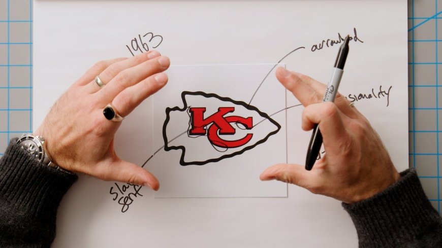
But what if the team were to re-think this logo? Designer Justin Thomas Kay tackled this question in the latest episode of “GQ Rebranded”, diving deep into the aesthetic history of a franchise that was founded in 1960 as the Dallas Texans before moving to Kansas City in 1963 and adopting the Chiefs name and logo that has become so ubiquitous today.
For Kay, that ubiquity is a huge part of the equation. He views the legacy franchises of American sports as the guideposts for an exercise like this, citing the Bulls, the Celtics, the Yankees, and Green Bay (“As a shareholder,” Kay notes, “I’m obligated to put the Packers in here.”) Any team exploring a rebrand, Kay suggests, should aspire to what those teams have achieved—a design philosophy that isn’t about chasing trends. “You want to really think on a decades-long timescale,” Kay says. “I would like to see more new team branding across all sports take that approach. Simplicity is one thing, but you want to be expressive and truly culturally resonant through that clarity and simplicity.”
Understanding that the Chiefs have a rich history—they played in the very first Super Bowl, after all—and have kept their look mostly untouched since the ‘60s, Kay didn’t want to completely overhaul things with his new design.
“It was an interesting challenge to look at a team that for all intents and purposes has no need for a new logo, but instead is an example of an identity that just needs some more connective tissue to pull together all the different pieces,” Kay said.
The result of Kay’s work is a new, lightly tweaked logo that gives the K and C some more room to breathe. He also put a slight remix on the arrowhead that forms the outline of the KC crest, and gave the team a new wordmark that incorporates a black outline. When it came time to rethink the uniforms, he suggested a stripe down the middle of the helmet, something that makes any football ensemble really sing.
“The main thing for me is to find something that really resonates with the fanbase and community culture. It needs to truly and honestly mean something to the fans.” Chiefs fans, while watching the team try to pull off a historic threepeat, spare a thought for how the team could also improve its wardrobe.


